Image: Apple
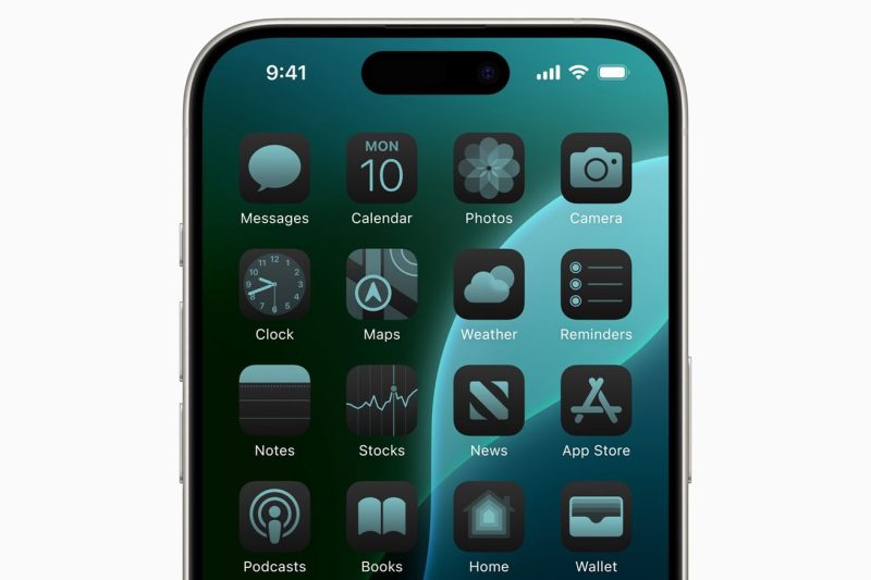
For years, I’ve kept a pretty spare iOS homescreen. Two or three rows of icons on the top of the screen, sometimes arranged in such a way that the app icon colors complement each other, and three apps in the dock. Because of Apple’s resistance to letting its users muck with the homescreen’s look and feel, I haven’t been able to make things quite as simple as I would like.
I’ve looked at more customizable Android homescreens with jealousy. I’ve had an iPhone since the day the first one came out, and while Apple’s smartphones have since become wildly more powerful, capable, and larger, the company has forced me to organize my apps starting from the top of the screen for 17 years.
Sure, my homescreen usually looked nice. But I’ve wanted…

